
Abstraction Pinterest Board


White Paper Test
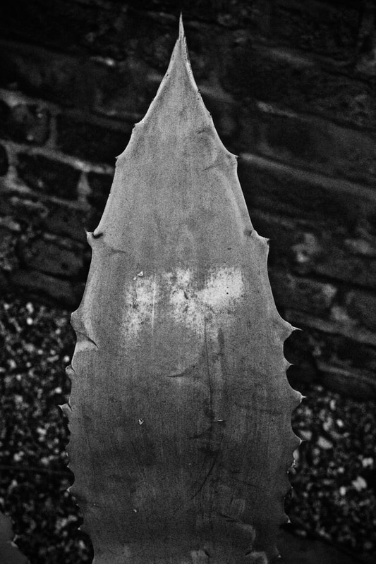
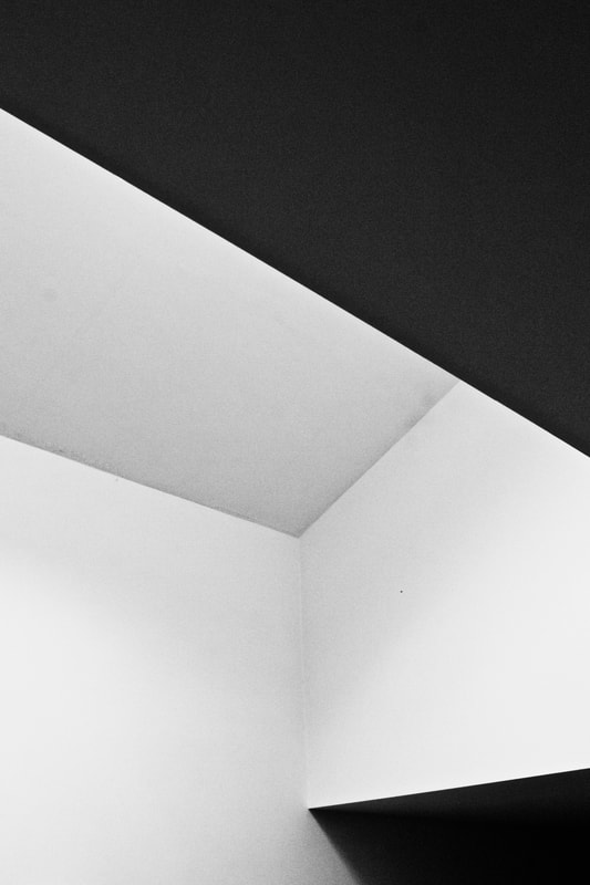
For this task we were asked to create a series of images using one piece of white paper. We had to experiment with different ways such as folding, rolling and crumpling it. The photographs should each be an individual, abstract piece, produced using spotlights and soft lightings. For my images I wanted to capture a beautiful sense of light and texture, making them appear as though they were works of architecture and mountains.

|

|

|

|

|

|

|

|

|

|

|

|

|

|

|
WWW - Excellent work showing strong understanding of composition tone and shadow.
EBI - Develop these using colour and texture.
EBI - Develop these using colour and texture.
Abstract Structure
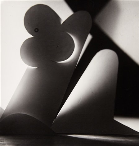
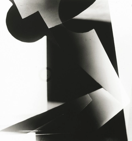
Jaroslav Rossler
Rossler was considered the pioneer for Czech Avant-Garde photography. In 1917 Jaroslav Rössler began his career as an apprentice in the Prague studio of Frantisek Drtikol, where he learned the techniques of oil, bromoil, pigment and other printing techniques. From 1923 to 1925, he also made a series of his own photographs, using contrasts of geometrical areas of light, shade and reflections with different shades of black, grey and white tones, and geometric shapes cut from paper and cardboard.
In the mid 1920s Rössler went to Paris to enlarge his photographic experience by working in some of the city's well-known studios. While in Paris he continued his photographic experiments, and his picture poems, photographs, collages and drawings influenced by Cubism were occasionally published in avant-garde periodicals. Although Rössler's work includes some of the most progressive and earliest examples of the application of abstract tendencies in creative photography, it remained little known even in his own country until the mid 1960s and 1970s.
In the mid 1920s Rössler went to Paris to enlarge his photographic experience by working in some of the city's well-known studios. While in Paris he continued his photographic experiments, and his picture poems, photographs, collages and drawings influenced by Cubism were occasionally published in avant-garde periodicals. Although Rössler's work includes some of the most progressive and earliest examples of the application of abstract tendencies in creative photography, it remained little known even in his own country until the mid 1960s and 1970s.
|
|

|
My response
For my first response to Abstract Structure, I was inspired by Jaroslav Rossler's work to create abstract, ambiguous silhouettes and shapes. For my series, I worked with the concept of light and experimented with different angles to produce soft shadows, adding to the geometric appearence of my photographs. I love how I captured gentle beams of light reflecting off the white paper, whilst having that stark contrast of shadow to compliment it. When photographing I experimented with using contrasts of geometrical areas of light, shade and reflections with different shades of black, grey and white tones, and geometric shapes cut from paper and cardboard. I really like how this series turned out as I really embodied Rossler's creation of light and shape.

|

|

|

|

|

|
Contact sheet first response

WWW - I experimented with shadow, shape and light responding well to Jaroslav Rossler. These images worked really well in response to our abstraction unit.
EBI - Incorporate other objects as well as the paper.
EBI - Incorporate other objects as well as the paper.
Abstract Structure Response 2
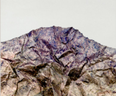
Brendan Austin 'Paper Mountains'
Austin described his work as "This is a narrative between the forces that pull and push our understanding of the place we stand. The isolated desert city running on oil generators, the Mars like landscapes of a volcanic environment and the mountains made from paper all attempt to start a conversation concerning the loss of meaning and reality. Building a sense of desertification in the various bodies of work."
|
|
For my second response to the Abstract Structure, my work was inspired by Brendan Austin's 'Paper Mountains' series. For my photographs I began using a single piece of paper and crumpling it into a mountain shape. I then used black and dark grey watercolours to gently wash over and drip onto the paper, giving the texture of a snowy, cold atmosphere of a mountain. I then set up my newly created mountain in front of another white piece of paper for a plain background when taking the images. When photographing I wanted to focus on the detail within my sculpture, allowing a more realistic texture when viewing it. I really like how these images came out as I incorporated the use of light and strong depth of field, producing the illusion of a real mountain.
My response to 'Paper Mountains'

|

|


WWW - Beautiful images that show an excellent understanding of depth of field.
EBI - Experiment with different materials in creating the mountains e.g plastic bags.
EBI - Experiment with different materials in creating the mountains e.g plastic bags.
Ordinary to Extraordinary
Edward Weston
Following from the Straight Photography movement came a group called F64, which Edward Weston happened to be apart of. He used high aperture setting to create images with a strong depth of field. The F64 group put emphasis on sharp images with the maximum depth of field promoting the unique qualities of photography. The name F64 came as they used the smallest aperture holes to create their images. Weston found that F64 still did not produce adequate depth of field, so he created his own aperture equivalent to f240, a pinhole. The soft chiaroscuro < light to dark>effect dramatised the image .
'Pepper No.30 was Weston's most famous photograph, which depicts a solitary green pepper in rich black-and-white tones, with strong illumination from above. Pepper No 30 was one of several peppers that Weston photographed in the series. It is a Gelatin silver print dimensions 19.1cm x 24.1cm which is one of 60 different versions. The framing of the pepper is tight to the edge of the print so enclosing the form in a deep spatial recess from which the form emerges with pent up energy emphasising the energy of its previous growth process. When Weston created his series, he looked at forms in art that find connections with nature, these are called biomorphic interpretations. Although not spiritual by nature, Weston hoped his 'Pepper No.30' would find connections to nature’s deep internal rhythms. The pepper remains a vegetable at the end of the day but its photographic form becomes a metaphor for aspects of the human body. Looking at the detail of the image, there are internal twists and turns which could reflect the skin and muscular tension of the human body.
'Pepper No.30 was Weston's most famous photograph, which depicts a solitary green pepper in rich black-and-white tones, with strong illumination from above. Pepper No 30 was one of several peppers that Weston photographed in the series. It is a Gelatin silver print dimensions 19.1cm x 24.1cm which is one of 60 different versions. The framing of the pepper is tight to the edge of the print so enclosing the form in a deep spatial recess from which the form emerges with pent up energy emphasising the energy of its previous growth process. When Weston created his series, he looked at forms in art that find connections with nature, these are called biomorphic interpretations. Although not spiritual by nature, Weston hoped his 'Pepper No.30' would find connections to nature’s deep internal rhythms. The pepper remains a vegetable at the end of the day but its photographic form becomes a metaphor for aspects of the human body. Looking at the detail of the image, there are internal twists and turns which could reflect the skin and muscular tension of the human body.
Pepper No.30, 1930
|
Shells, 1927
|
Response to Edward Weston
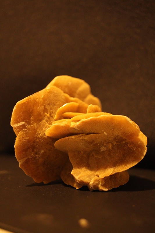
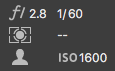
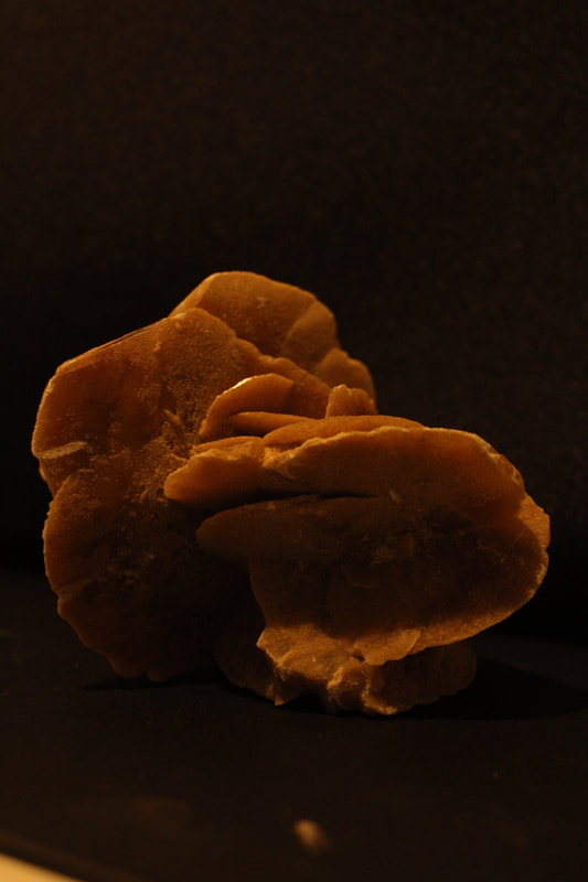
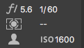
For this task we were asked to create a series of abstract photographs, inspired by Edward Weston's work. Our images were to be of ordinary objects possessing interesting shapes and textures, particularly in response to Weston's most famous 'Pepper No.30'. We started the first task by placing these objects in front of a plain black or white background in natural lighting. For my piece, I picked out unusual ceramic pots and vases that would create a beautiful sense of texture, complimenting with the natural light. I also used a Sand Rose, which is a crystal formation made from sand being blown from the wind in the Qatar desert, I loved the different layers it had which allowed multiple surfaces for the light to bounce off and produced subtle shadows within it. I lastly used an avocado and a stalk of tomatoes, I used Weston's composition techniques to create the look of a sculpture. For the avocado especially, the natural light worked really well as it made it have an almost glossy texture and a pretty shine to it.

|

|

|

|

|

|
WWW - I successfully responded to Edward Weston's photographs, focussing on the control of light and detail to texture. I captured a beautiful sense of contrast within the images, creating a gentle shadow and light elements to the objects.
EBI - Try to experiment with more ordinary, everyday objects like 'Pepper No.30' and create an ambiguous shape with it.
EBI - Try to experiment with more ordinary, everyday objects like 'Pepper No.30' and create an ambiguous shape with it.
Original Images

Artificial Light
For our second response to the 'Ordinary to Extraordinary' task, again we had to take a series of images with everyday objects to create abstract shapes and textures but used with artificial light. I used a black background to create a stark contrast between the objects and the surroundings. When capturing the photographs, I found that the camera settings were easier to adjust in order to compliment the artificial light. The light source I used was angled facing down towards the focus, allowing an almost illuminated appearance to the objects, this is particularly apparent in the second image where it highlights the lettuce's veins. The lighting produced gentle shadows onto different areas of the surfaces which worked really well in response to Weston's images.

|

|

|

|

|

|
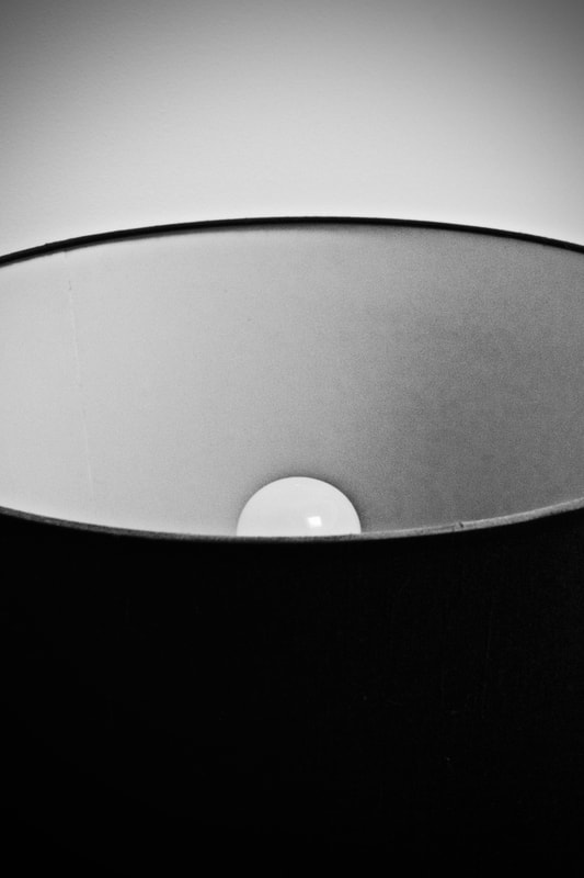
Bracketing Exercise
This bracketing task allowed me to see the specific control in aperture you have, when it comes to taking a photograph. Aperture refers to the opening of a lens's diaphragm through which light passes. Lower f/stops give more exposure because they represent the larger apertures, while the higher f/stops give less exposure because they represent smaller apertures. By using the Aperture Selector on my camera, I adjusted the setting each time from f 2.8 to f 7.1, creating less and less light onto the image. Much like working in a darkroom and producing a test strip, the bracketing task made me acknowledge the right setting to use for the best outcome in the final image.
|
|
|
|
Second response to artificial light

|

|

|

|
WWW - Both sections are strong with an beautiful use of light and texture, the black background I shot with worked particularly well for my 'Artificial Light' responses.
EBI - It would be good to see my set up and how I captured these images.
EBI - It would be good to see my set up and how I captured these images.
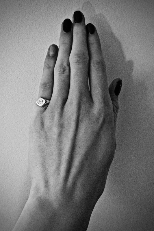
Abstraction of the Body & Nature
Alicja Brodowicz
"I photograph the human body – the microcosm, Its’ fragments: hair, scars, texture of skin, wrinkles. I am interested in individual particularities; I look for distinguishing features and irregularities. Imperfections are my favourites.”
“I photograph nature – the macrocosm, surface of water, grass, tree bark, dry leaves. I combine the two images, looking for converging lines, textures, similarities in layout and analogies in composition between the microcosm and the macrocosm. I look for unity between the human body and the nature.”
“I photograph nature – the macrocosm, surface of water, grass, tree bark, dry leaves. I combine the two images, looking for converging lines, textures, similarities in layout and analogies in composition between the microcosm and the macrocosm. I look for unity between the human body and the nature.”

|

|

|
Agnieszka Lepka
In her ongoing series titled "Human Vs Nature", Lepka works with the similarites between the human being and Mother nature. Veins are put into relation with Topographic maps, fingerprints resemble a tree trunk and cacti are compared to scrubby beards.

|

|

|
Abstraction of the Body & Nature
My Response
For this task in 'Abstraction' we had to create series of photographs depicting the parallels between the human body and nature. Inspired by artists Agnieszka Lepka and Alicja Brodowicz, we were asked to look out for a unity between the two images, focussing on capturing converging lines, similarities in compositions and layout etc. For my images, most of my natural objects and plants were photographed indoors against a white, allowing an easier shoot and link with the body representation. I used parts of washed up wood to create a figure of a hand, paying attention to the creasing and cracks, resembling older human skin.

|

|

|

|

|

|
|
|

WWW - I successfully took a series of captivating images with an interesting use of texture and shape.
EBI - Create one more set to go along side a nature image.
EBI - Create one more set to go along side a nature image.
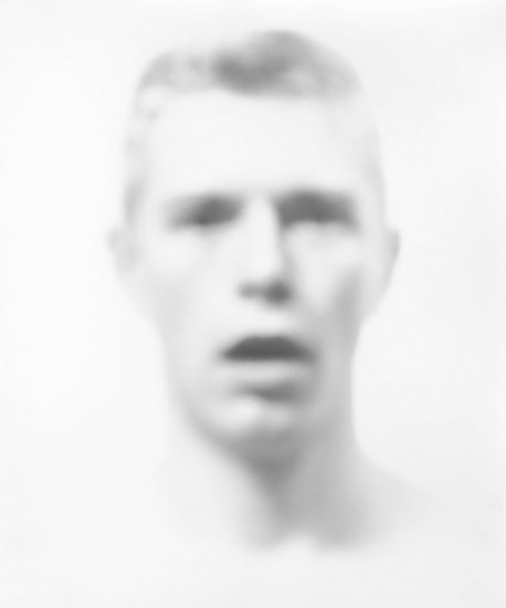
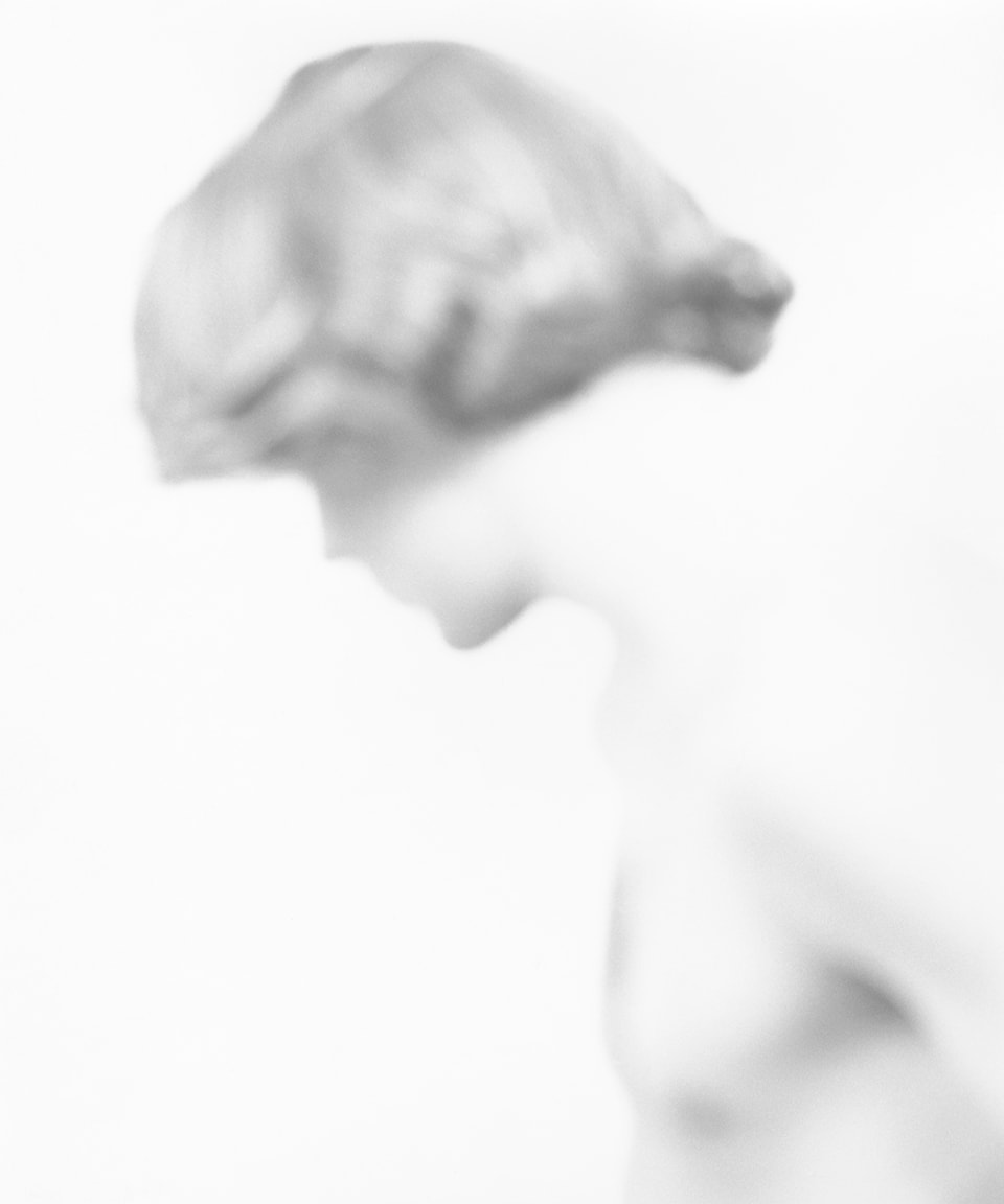
Abstract Portraits
Bill Jacobson
Context
Bill Jacobson is an American photographer who began his signature 'defocused' monochromatic images in 1989, which defined Jacobsons' early successes. Each photograph depicts a man’s face, its edges and features blurred and softened in a painterly style that reflected Jacobson’s preoccupation with loss and mortality in the early 1990s; themes closely tied to his observations of the AIDS epidemic. He also collected anonymous old snapshots at flea markets which would immediately bring to mind that the subjects were no longer alive, or were decades older than when the images were made.
Inspirations
The faces are hard to grasp, difficult to discern as they recede into the white field of the photograph. Jacobson conveys the sense of futility in trying to capture a human likeness in memory or portraiture. Jacobson was specifically inspired by early twentieth-century photography and the blurred or obscured subjects of the medium’s early pioneers. He spent a lot of the 1980s collecting early twentieth-century anonymous snapshots from flea markets. The figures in them were often blurred or obscured, and this became a parallel for the passage of time, illness, or death. I often think of Roland Barthes writing in Camera Lucida that every photograph is of a dead moment.
|
|

|
Intentions
Jacobson was interested in the ‘layers of time’ that these photographs revealed, and by their ability to transport the viewer back to the precise moment in time when they were created, when the people, their lives and their surroundings were ‘current’. The pictures denied representations of physicality in part because there was no detail, instead they were intended as a metaphor for an inner state of being. These qualities referred to memories, dreams, and how the mind usually retains only fragments of information.
Techniques
His images were created using expressive techniques which produced a blurry, defocused and diffused appearance. Whether Blumenfeld was working in black and white or colour, it reduced the images down to areas of tone, colour, or forms adjacent to each other within the frame.
Erwin Blumenfeld
Context
Considered as one of the most innovative and influential photographers of the 20th century, Erwin Blumenfeld made a significant contribution to the fashion industry between 1940’s and 1950’s. His photographs were on the postwar pages of Vogue, Harper’s Bazaar, Cosmopolitan, Life and Look magazines. Blumenfeld brought art and audacity to fashion photography, in a way that had never been seen before in the history of the medium, and has rarely been seen after. Blumenfeld takes photographs of mainly women, not so much about how the women looked, but more about how he perceived them. His iconic work, especially in the forties and the fifties, was not so much about what an era looked like, but about how an entire generation perceived the way it looked.
Inspirations
Blumenfelds' main inspiration were of the women he photographed. He had a fetish for beauty and the obsession with women came out in the images as he made them seen alive. He drew his early inspiration from the Dadaist whom he owes his passion for photomontage. Of crucial importance was the work of Man Ray, whose photographs he saw in one French magazine of the time, which inspired him to push further with his own experiments.
|

|
|
Intentions
Blumenfelds' work simultaneously expressed a sense of desire from the woman and beautifully defined the age visually. He wanted to illustrate that fashion wasn’t as much about fashion itself, but about perception. Later on in his work he created his 'psychological portraits', which under covered the reality under the surface.
Techniques
His work included fashion films, black and white prints and hundreds of negatives. His repeated use of techniques such as translucent screens and multi-angle kaleidoscopic mirrors was no surprise, keeping in mind his strong surrealist leanings, his pictures always having an interplay of what’s visible and what’s imaginable. From his beginnings, Blumenfeld was experimenting with colors, darkroom techniques such as solarization, multiple exposures, combining positive and negative image. He also explored the use of mirrors and light. One of his most iconic photographs consisted of his typical surrealist techniques, where he cut out the shadow underneath a hat and left the little details in the image such as the dash of colour from the lipstick.
First response to 'Abstract Portraits'

|

|

|
WWW - Experimented with colour and texture of the image, similar to Erwin Blumenfeld's distorted glass photograph.
EBI - Get closer to the subject, don't wear black clothing as it gets rid of the centre focus.
EBI - Get closer to the subject, don't wear black clothing as it gets rid of the centre focus.
Second Response to 'Abstract Portraits'
For my images I wanted to embody Erwin Blumenfelds’s sense of distortion. The first photograph on the left was captured using gentle rays of light, reflected through blue transparent plastic. The image on the right was taken through a vase with an abstract texture, creating an obscure appearance to the surroundings. I was inspired by Blumenfeld's use of texture and obscuring objects woven into his portraits.
|

|

|
|

|

|
WWW - I experimented with an interesting use of screen, water, texture and glass to create these colour edits.
EBI - Add colour edits, try out Bill Jacobsons' technique.
EBI - Add colour edits, try out Bill Jacobsons' technique.
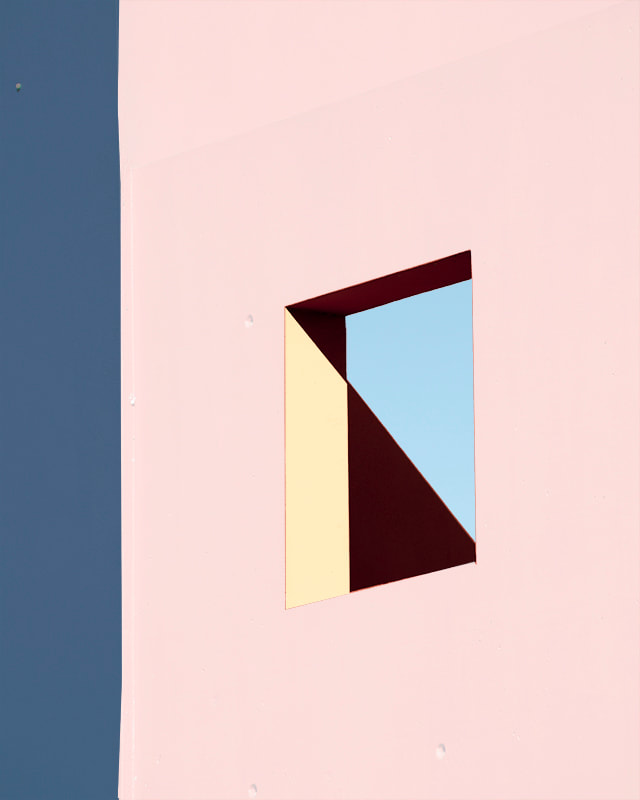
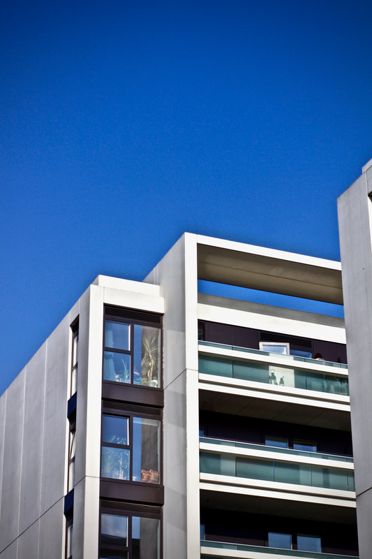
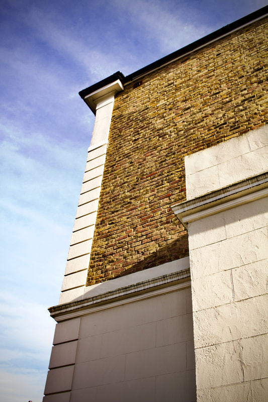
Ambiguity & Abstract Architecture
Johnny Kerr
Ambiguity is a sustained investigation of Antoine Predock's Nelson Fine Arts Center in Tempe, Arizona. Kerr spent hours photographing, waiting and observing how the lines, shapes and forms changed as the sun moved from morning to late afternoon, revealing new relationships of harmony or tension. The ambiguous forms, shapes and textures of the almost featureless stucco exterior intrigued Kerr as a designer. By observing how the structural lines intersected from various vantage points, Kerr was often able to confuse the visual perception of foreground and background. The pastel colour palette is inspired by the building’s southwest geography and was a challenging visual departure from my previous monochromatic approach to abstract architecture.

|

|

|
My response to 'Ambiguity'
For this task responding to Johnny Kerr's 'Ambiguity' series, we were asked to produce several photographs, capturing the shadows in the intersecting lines, finding the tonal balance and experiment with light. Photographer Kerr waited for the perfect time to shoot and create ambiguous forms, shapes and featureless textures.
WWW - I demonstrated a good understanding to the outcome of the task. I captured the idea of shadows within the intersecting lines of my walls and experimented with the different shades.
EBI - Experiment with lighter tones, flatter lines to add to the sense of ambiguity. Try photographing in a brighter time of day and incorporate colour e.g blue skies.

|
|

|

|
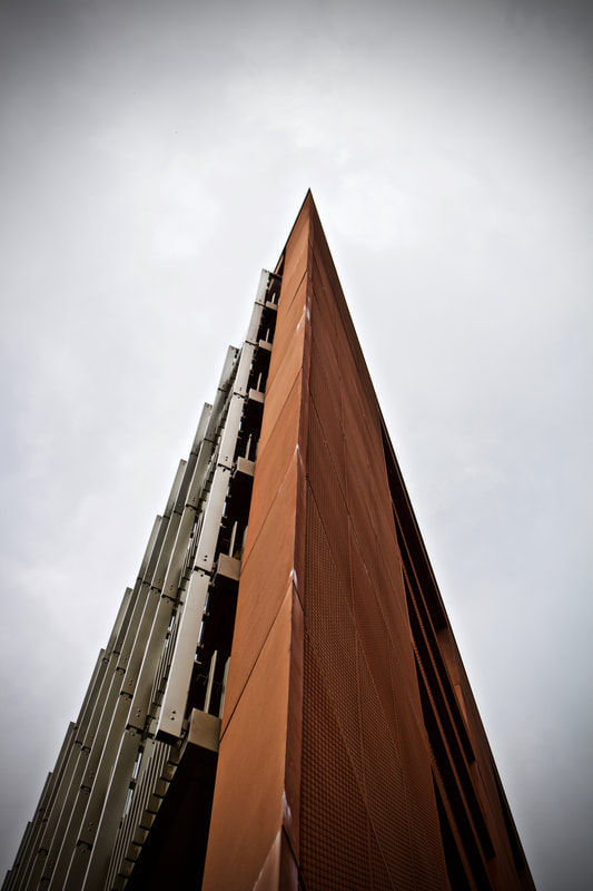
Matthieu Venot
Focusing his lens on architectural details and adopting fairly constructivist angles, the artist succeeds in creating abstract geometric images. He only photographs when the weather is incredibly good and thus Matthieu uses the immaculate sky like the background in a studio. This, he maintains, is his way of not disturbing the composition of his pictures : simple and graphic. Lines cross over and overlap. shapes stand out from this blue background and have us forgetting what we are observing : a roof, a wall, a railing, a balcony. The blue sky background also enhances the colours. Colour is, in fact, of the utmost importance in Matthieu Venot's photography. Excluding the Breton greyness, the photographer transforms the town and has us thinking more of California or Florida. According to the artist, the choice of pastel colours is a way of transmitting, through his photos, his own personal optimism.
|

|

|
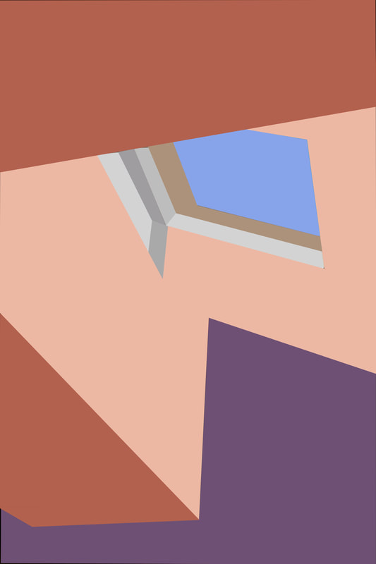
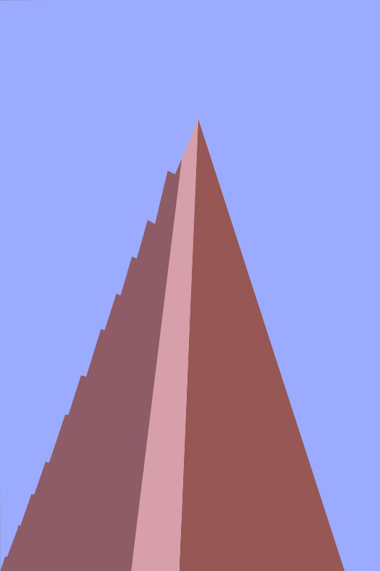
My response to Matthieu Venot
For this practical task, we had to respond to Matthieu Venot's series of images depicting a range of colours and shapes. Using our last set of photographs, capturing the shadows in the intersecting lines from walls, inspired by Johnny Kerr, we opened the images in photoshop to start editing. Venot explored with photographing architectural details and adopting fairly constructivist angles, he succeeded in creating abstract geometric images. Firstly I used the Polygonal Lasso Tool to select the specific areas you want, then proceed to fill the shapes in the certain colours.
|

|

|

|
My Photoshop Process
WWW - Successful response to the two artists and a complete section that demonstrates solid photography skills alongside excellent photoshop work.
EBI - Go outside and experiment with interesting architectual shapes.
EBI - Go outside and experiment with interesting architectual shapes.
Abstract of Personal Truth and Temporality
Sarker Protick work's experiment with the idea of temporality, materiality of time and the metaphysical prospects of Light and Space. Temporality is the state of existing within or having some relationship with time. Materiality means the quality or character of being material or composed of matter (how would this relate to 'time'). Lastly, metaphysical is the transcending physical matter or the laws of nature.
Sarker Protick - Rasmi
Protick is interested in themes such as alteration of land and border, colonial relics and modern ecological emergencies. His landscapes, portraits and photographic series engage philosophically with the specificities of personal and regional histories.
One of Protick's most famous works is Raśmi (meaning 'a ray of light' in Bengali). This series involves the arrangement of images and soundscapes, presented as a video projection. The work explores the ideas of personal truth and fiction, with its pretext being non-geographical, a non-place and yet universal in its stimulation. Intertwined with the images, the immersive soundscape works almost as a narration of the sequence. This light which is almost omnipotent throughout Sarker’s depiction of the objects – as those of the cosmos – creates situations as lucid as it can get in its meaning. Anchoring it further in its universality, is the recurring presence of the circular form photographed from varying vantage points, empty or hollow and at times illuminated at a distance. In between this intricately carved pattern of imagery and sound, one could find oneself hoping for a hope, to breathe – inhale-exhale and to let go.
One of Protick's most famous works is Raśmi (meaning 'a ray of light' in Bengali). This series involves the arrangement of images and soundscapes, presented as a video projection. The work explores the ideas of personal truth and fiction, with its pretext being non-geographical, a non-place and yet universal in its stimulation. Intertwined with the images, the immersive soundscape works almost as a narration of the sequence. This light which is almost omnipotent throughout Sarker’s depiction of the objects – as those of the cosmos – creates situations as lucid as it can get in its meaning. Anchoring it further in its universality, is the recurring presence of the circular form photographed from varying vantage points, empty or hollow and at times illuminated at a distance. In between this intricately carved pattern of imagery and sound, one could find oneself hoping for a hope, to breathe – inhale-exhale and to let go.
Click to see full 'Rasmi' video piece

Sarker Protick Quotes in Rasmi

|

|

|
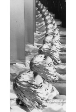
My Response to Rasmi
For our practical task in response to 'Rasmi', we were asked to explore the ideas of personal truth and fiction and take a series of abstract images that I felt represent my experience. We had to remember that the images can be subjective and ambiguous, so we shouldn't be afraid to be experimental within the shoot. In my series, I wanted to capture the details and contrasts within each individual image. I encapsulated themes of nature, indoor spaces, objects specific to lockdown and things relating to my personal routine. I looked for different textures in the rooms of my house such as wood, metals, fur and interesting architectural features.
Post Production Work
'Rasmi' Inspired Layout


My Protick Inspired Gif

How to create the Protick inspired Gif
WWW - An excellent understanding to Protick's work.
EBI - To improve further, experiment with adding sound to my GIF.
EBI - To improve further, experiment with adding sound to my GIF.
3 Strands Abstraction
Looking back on our Abstraction unit, we explored and experimented with light, shape, tone, colour and perception. For our next task, we had to choose three past responses from this unit, to develop my ideas and photographs further. For my 3 Strands project, I decided to develop the work of Edward Weston, Johnny Kerr and Sarker Protick. All three artists explore the light and ambiguous viewpoints, which I thought would compliment nicely with each other as they also parallel similar themes.
First Strand Ordinary to Extraordinary
Edward Weston Development
'Pepper No 30'
|
'Shells'
|
'Pepper No 35'
|
My Response
For my first strand, I responded to Edward Weston's work to develop my original set of photographs. Looking back at my previous responses I found that using artificial light worked well with a black background to create a stark contrast between the objects and the surroundings. When capturing the photographs, I found that the camera settings were easier to adjust in order to compliment the artificial light. The light source I used was angled facing down towards the focus, allowing an almost illuminated appearance to the objects For my piece, I picked out unusual, manmade and natural objects, working with shadow, light and angles, that would create a beautiful sense of texture.


|


|

|

|

|
EW Response Contact Sheet

Second Strand Abstract Architecture
Johnny Kerr Development
For my second strand, I wanted to develop Johnny Kerr's series, which explored with photographing architectural details. For my first response earlier on in the unit, I photographed interesting view points and angles in my house, looking out for the intersecting lines and shadows in which I could incorporate colour into. For this strand I wanted to try out with new locations and more abstract architecture. In my work I wanted to adopt fairly constructivist angles, and I feel like I succeeded in creating captivating, geometric images.
Original Photographs & Photoshop Edits

|

|
|

|
|

|
|

|
|
|
WWW - Created successful photoshop and originally composed images, working with tone, shade and colour.
EBI - Experiment with more abstract architecture.
EBI - Experiment with more abstract architecture.
Third Strand 'Rasmi'
Sarker Protick Development

'Rasmi' Response Images
For my third strand I wanted to develop my 'Rasmi' work, and find more abstract details within the images. Protick wanted to work with layers and intertwine within the images, the immersive soundscape works almost as a narration of the sequence. The light which is almost omnipotent throughout Sarker’s depiction of the objects – as those of the cosmos – creates situations as lucid as it can get in its meaning. For my first response to Protick, I mostly photographed my everyday routine in lockdown, and incorporating old images I had taken. For this response and strand I experimented with both indoor and outdoor surroundings.
|

|

|

|

|

|
'Rasmi' Edits
For the editing process I used the same technique as my first response to Protick. I used borders and a similar layout to show the contrasting and compelling combinations of images. The photographs I captured reflected my time and atmosphere at home in lockdown. It was interesting to see the contrasts between indoors and outdoors, colours and shapes.

Shape, Light & Colour Development
After exploring the meaning of 'Abstraction' in art and photography, looking at several experimentative artists and completing our 'three strands', we moved onto developing towards a final piece for this unit. For developing my work I loved looking at exploring with shape, light, colour and working that in with abstract techniques. Throughout the unit, Erwin Blumenfeld's photography was something that struck out to me, from his experimentation with unconventional methods, portraiture and colour.
Playing With Colour & Texture

|

|

|
Erwin Blumenfeld 'Film Noir'
Erwin Blumenfeld was one of the greatest innovators of twentieth-century photography. From his early Parisian black and white nudes to his colourful and glossy fashion photography made in 1950s and 60s New York, he consistently pushed both stylistic and technical boundaries. He paid little notice to photographic conventions and traditional practice, using innovative and unconventional techniques. The portrait of the American model Teddy Thurman is strikingly contemporary, with Blumenfeld manipulating the print so Thurman appears both in full view and in profile. His masterful printing techniques see half of his sitter’s face appear as if in an x-ray. His experiments lend the photograph a varied sense of depth and perspective, playing with traditional notions of portraiture and giving the image a surreal quality.

|

|

|
For this development I responded to Blumenfeld's abstract work, capturing his 'Film Noir' type photography, where he consistently pushed technical boundaries of the time, using unconventional art and photographic forms. For my process, I used a light projector onto a white wall. Using a piece of card which had lines cut in between, I placed it onto the projector which reflected onto the model. These lines created gentle shadows and tones, adopting Blumenfeld's photographic appearance. Working with the lines which were formed by the light, it emphasised the look of the models eyes, something Blumenfeld focussed a lot on during his photographic era.

|

|

|

|

|

|
20th Century Cubist Art
Pablo Picasso & Georges Braque
The best examples of the Analytical Cubism style were created in 1910 and 1911, although some works were written in 1909, and even later, in 1912, at the beginning of the colourful and concrete synthetic Cubism period. Picasso believed that art is capable of more than just showing the things that our eye sees. He thought that there must be a way to show the world as it is “in reality”. The paintings typically featured a subject and the background surrounding it – are one and the same. The separate items in this unified structure of the reality do not have clearly defined borders. All sort of figurativeness disappears. We just see incomprehensible, icy, fragmented, homogeneous mass which has no texture, no internal differences. We can guess what is depicted only with the help of specific details, hints that Picasso called “attributes”.
'Friendship' Picasso, 1907
|
'Harbor', Georges Braque, 1909
|
'Weeping Woman' Picasso 1937
|
My Response & Development
For my Shape, Light and Colour development, I was inspired by 20th Century Cubist Art, in particular Picasso and Braque's work. Both artists experimented with colour techniques to create unconventional shapes and structures. All sorts of figurativeness fades, which produces fragmented forms. For my response to the art, I decided to apply the appearance of the art onto a portrait I had captured. I used the original image before editing to black and white, cropped multiple areas then finally layered them to construct a distorted, cubist imitation on photography. For my photographic process I considered using contrasting colours of the originals photographs to represent a different facial expression.

|

|
Edited Images

|

|

|
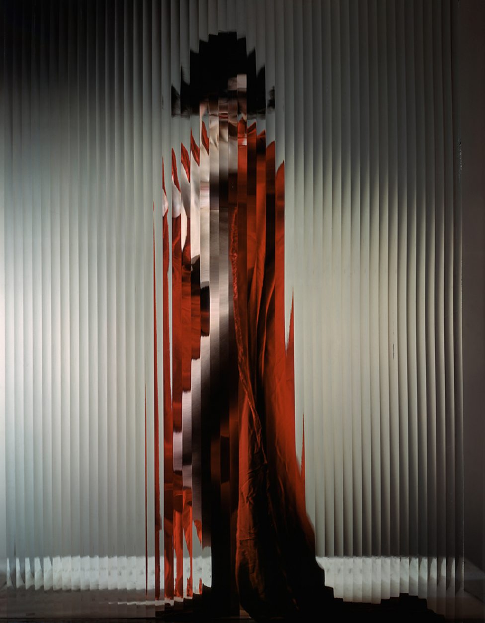
Fragmented Face
My main influences for this project were some of the great portrait photographers such as Erwin Blumenfeld and Jacques Henri Lartigue.

|

|
For my final response, I decided to create a piece called the 'Fragmented Face'. I was strongly inspired by two of the most famous portrait photographers, and my personal favourites, Erwin Blumenfeld and Jacques Henri Lartigue. Throughout this unit we explored the extent of 'Abstraction' in both Art and Photography. By experimenting with several techniques, context and inspirations, we found what the term means to us. For these two portraits, I wanted to capture a beautiful sense of abstraction and meaning within the face. In terms of my photographic method, I used two mirrors and placed them over one another. In doing so, it mimicked the appearance of a split face, in a cracked mirror. By experimenting with different angles and light, I found a way to encapsulate Lartigue's and Blumenfeld's sense of distortion within a portrait.

|

|
